An e-Portal Re-Design Concept

A CASE STUDY

The First Step Matters

How onboarding shapes the user-experience.

PROBLEM

Many user errors in the DSWD travel clearance system are not due to user negligence, but due to unclear onboarding, ambiguous field labeling, and lack of guided validation.

As a result, users unknowingly input inconsistent or incomplete information, leading to application rejection, duplication of accounts, and increased reliance on external support channels.

Jump to the story behind this case study

THE EXISTING WEBSITE

Onboarding isn’t just the “first step”—it’s the moment where users form their mental model of a system. If that model is wrong or incomplete, everything that follows becomes harder, slower, and more error-prone.

BEFORE

RE-DESIGNED

Disclaimer: This is a conceptual redesign created for UX exploration and portfolio purposes. It is not affiliated with or endorsed by the original organization. All trademarks and brand elements are the property of their respective owners.

RE-DESIGNED WITH CLARITY

The re-designed e-services portal of DSWD and a clearer and re-structured onboarding user-flow and more consistency in the visual hierarchy.

WHAT THIS RE-DESIGN SOLVED

  • No more guesswork on what to input. Helper text and instructions are clearly indicated.
  • Important fields are explained upfront so users don’t accidentally enter the wrong information.
  • No need to create a new account just to fix errors, users can review and correct details before moving forward.
  • Less confusion between login and personal details. The system separates account setup (email/password) from legal identity information.
  • The long form is broken into smaller, structured and manageable steps.
  • Helps users prepare before starting with check list links. 
  • Makes the process feel clear and predictable.
  • Reduces chances of application rejection.
    Clear instructions and confirmations help ensure accurate submissions.
  • Builds user confidence and trust.
  • Saves time and effort.
    Prevents repeated submissions and unnecessary backtracking.

WIREFRAMES

ICONS by AI

MY PROCESS

RESEARCHED & GATHERED DATA 

  • ChatGPT to help simplify, better  clarify the problem and tips to  re-structure of the user-flow.
  • Threads, Facebook and Reddit for user experiences of the portal.

WIREFRAMING

  • created low-fidelity wireframes as my draft designs, iterating on the spot while doing research.
  • Tools used for visual  inspiration: Figma Make, Canva, Google Search
  • Created a style guide with updated colors, logos and icons.
  • Compiled data, visual concepts while retaining the overall visual aesthetic and branding of the existing website and designed the high-fidelity wireframes.

REFINING AND FINAL DESIGN

  • Checked each screen, edited and added to areas that I felt needed more information or would enhance the visuals. 

THE STORY, THE WHY

I applied for a travel clearance for my son, a minor, from the DSWD website. 

MY EXPERIENCE

When creating an applicant account I did not input my full name as “given name” was the label in the input field. This created problems for me when I submitted the application because my applicant name was not the full name in my birth certificate.

SCENARIOS

  • I first tried to create a new account using my email address and was denied because I already had an account under that email address (I forgot about that). 
  • I logged in again and tried to edit. The name field was non-editable. 

PROBLEM CASE

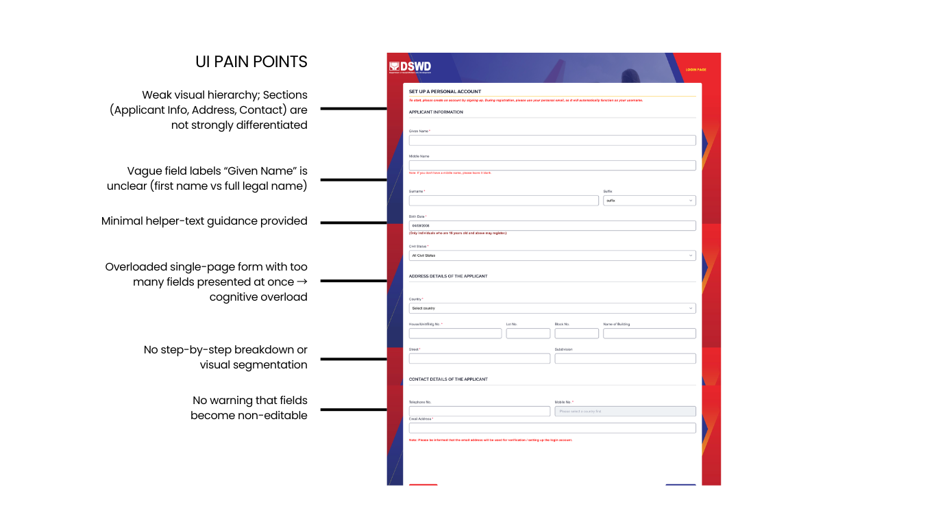
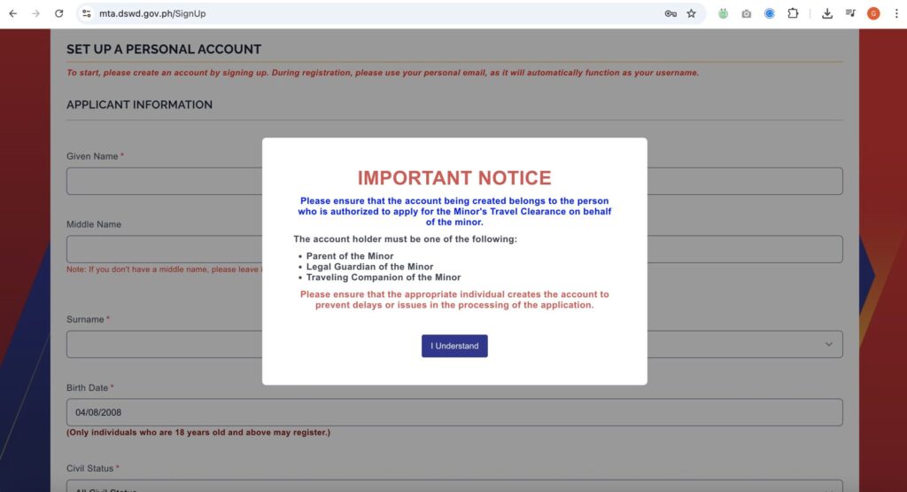
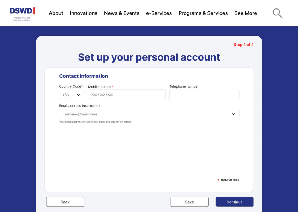
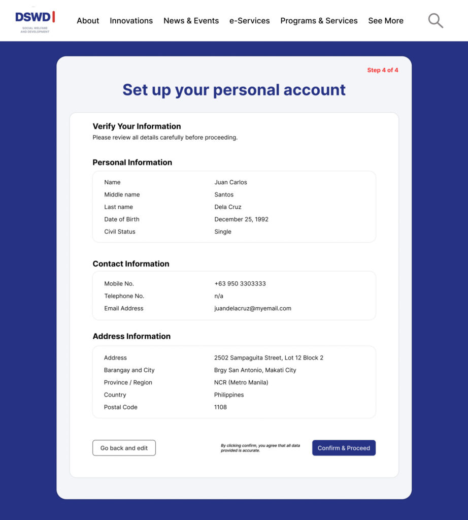
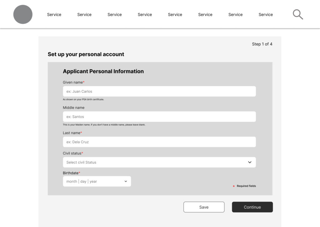
I remembered that this was an issue I encountered already in a previous application, also for travel clearance, because there was a discrepancy in my name (it lacked my middle / second name) and didn’t match my birth certificate and ID in the submitted form. 

I searched for the profile page and tried to edit my name to include my middle name. The input fields were locked and non-editable. Although I knew it may be a problem again, I still submitted the form, hoping I could help from customer service.

True enough, my application was, as indicated in the emails, “TOTALLY DENIED.” 

Because I knew it would be an issue again, I tried contacting the numbers indicated in the website, messaged via Viber as instructed, chatted with their bot and tried and argued with the officer who called to tell me about the discrepancy and the disapproved application. Nothing came out of it. 

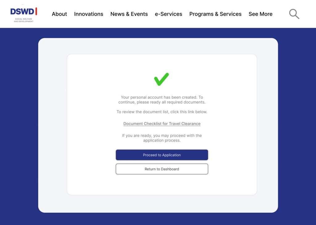
I was told to, “create a new email address or use another existing then create a new account and repeat the process. 

Not only was all this experience a waste of time, effort and money (because a new application meant a new payment) the overall experience was FRUSTRATING. My emotions were tapped— angry, disappointed, annoyed and totally dissatisfied.

But again, what is the point of arguing with a system that relies more on compliance than to provide users support and an overall good experience? It’s frustratingly a system that sets one up for failure.

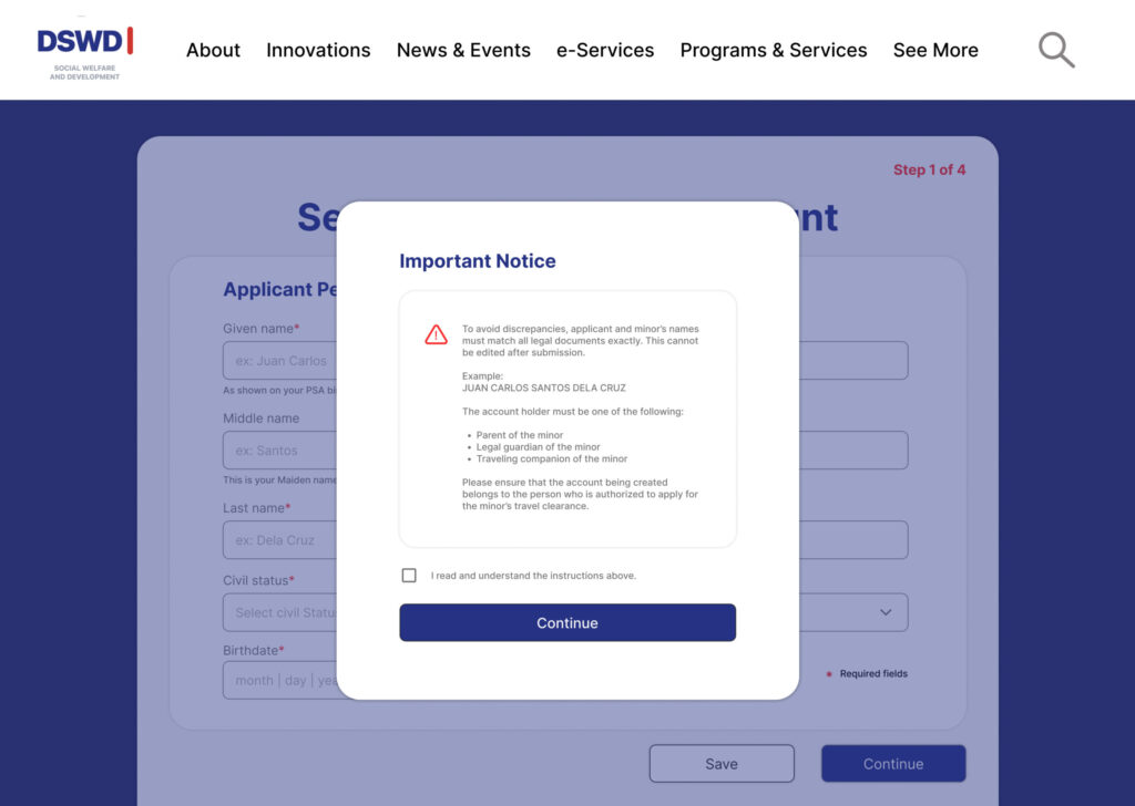
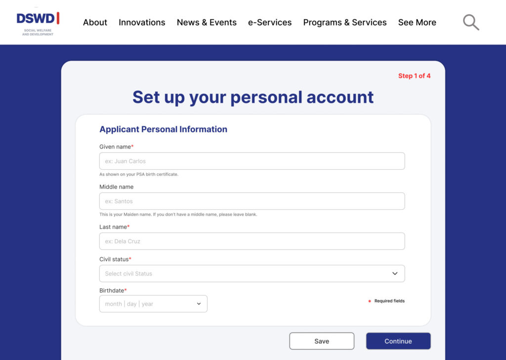
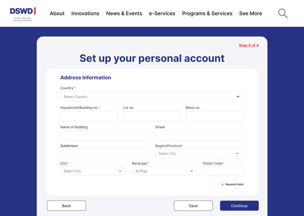
So instead, I decided to pour all my emotions into re-designing and thoughtfully structuring the onboarding user-flow and do a case study, an audit of the existing features– to find a solution to my encountered problems / pain points.

Scroll to Top